
the power of a color scheme + photography style
When you look back at your wedding photos years from now, what you’ll remember most isn’t just what everything looked like; it’s how it felt. And so much of that emotion comes down to two key creative choices: your color scheme and your photography style.
These two elements, one rooted in design, the other in storytelling, work together to define the tone of your entire day. They influence everything from your guests’ first impression to the way your photos live on in your home, your album, and your memories.

Color: The Foundation of Emotion
A thoughtful color palette doesn’t just make your wedding look cohesive; it sets the mood before a single photo is taken. The colors you choose can whisper romance, radiate energy, or ground your day in calm, timeless beauty.
Here’s how different tones can completely transform a celebration:
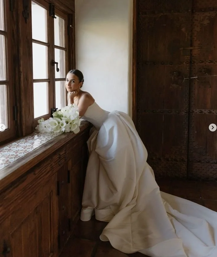
Neutrals & Whites - classic, refined, and effortlessly elegant. These tones let the emotion and natural light shine. Perfect for couples who love minimalism, heritage architecture, or a soft countryside aesthetic.
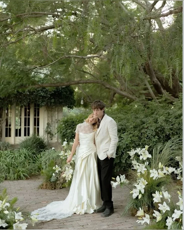
Earthy Browns, Terracotta & Copper - warm, organic, and grounded. These colors feel intimate and natural, pairing beautifully with rustic venues, outdoor vineyards, or modern garden settings.
Pastels (Blush, Sage, Dusty Blue) - romantic and airy. Pastels are soft and timeless, often creating a whimsical, dreamlike quality in photos.
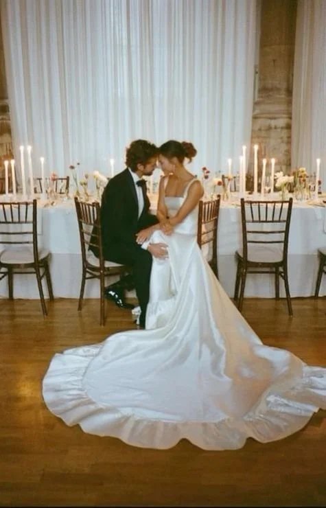
Bold Jewel Tones (Emerald, Burgundy, Navy) - dramatic and luxurious. These palettes photograph beautifully against darker lighting or moody interiors, evoking depth and sophistication.
Monochrome or Minimal Palettes - modern, sleek, and editorial. Think black and white with subtle accent hues. It’s ideal for couples wanting that fashion-forward look.


Photography: The Art of Memory
Just as color sets the design tone, photography defines the emotional tone. Your photographer’s approach, lighting, editing, composition, and even the camera format, determine how your story is told.
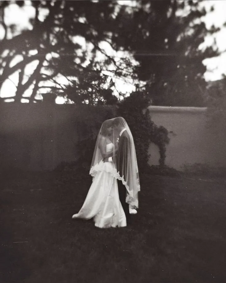
Film vs. Digital
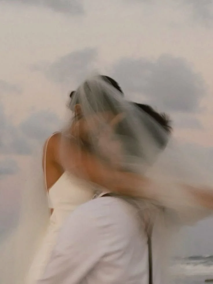
Film photography often evokes a sense of nostalgia and softness. It has natural grain, slightly muted tones, and organic light transitions that feel timeless. Film captures emotion with imperfection, the slight blur of movement, the sun flare through lace, which often feels deeply romantic.
Digital photography provides sharp clarity and flexibility. It can capture bright, crisp details and allows for creative color grading, ideal for couples who want bold, clean, or editorial imagery.
Many modern photographers now blend both: shooting digital for versatility and film for texture and soul. This hybrid style gives couples the best of both worlds: precision and poetry in the same gallery.


Photography Styles
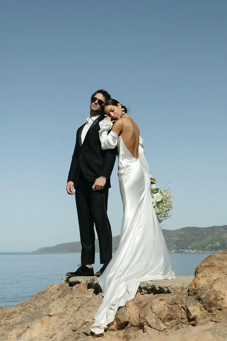
1. Editorial Style
Vibe: Chic, fashion-forward, and dramatic.
Best for: Modern venues, black-tie weddings, clean color palettes (white, black, gold, or neutrals).
Color Schemes That Shine: Minimalist monochrome, modern neutrals, or jewel tones for contrast.
Why It Works: Editorial photographers use striking poses, high-end lighting, and magazine-style editing — making bold color contrasts and sleek palettes pop.

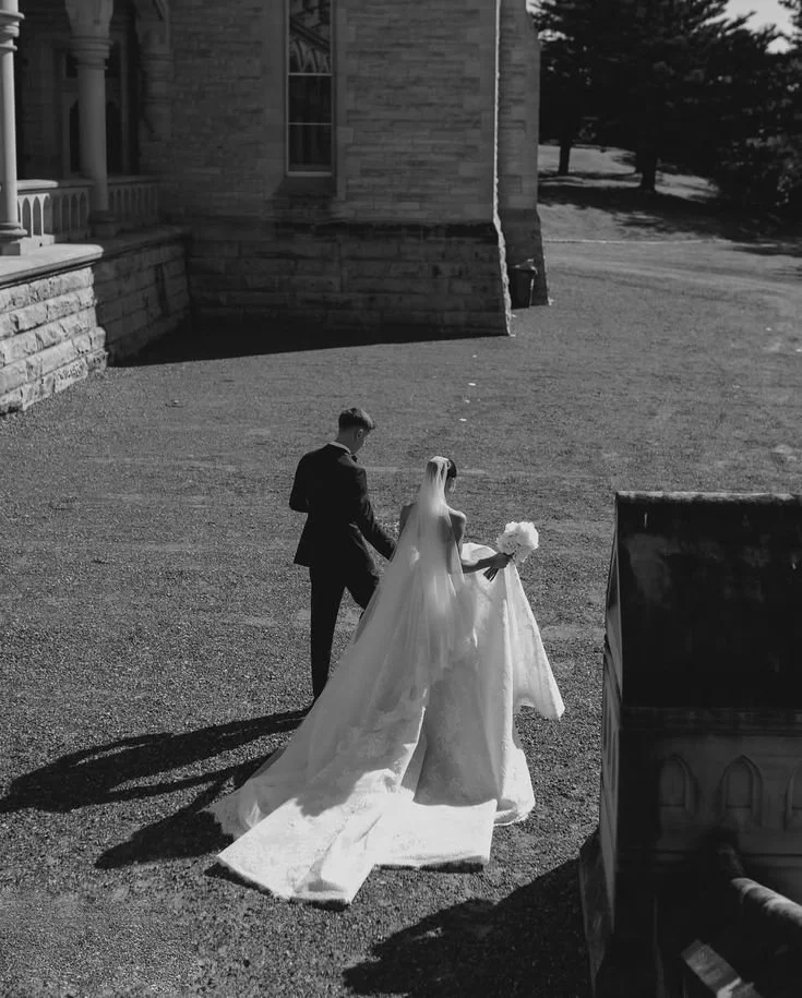
2. Photojournalistic / Documentary
Vibe: Authentic, candid, storytelling.
Best for: Outdoor venues, rustic barns, backyard celebrations, destination weddings.
Color Schemes That Shine: Earthy, natural tones — sage, taupe, dusty blue, terracotta.
Why It Works: This style emphasizes real moments and ambient light, so natural, organic palettes look timeless and unforced.


3. Fine Art
Vibe: Dreamy, painterly, and romantic.
Best for: Gardens, estates, vineyards — anywhere with soft light and texture.
Color Schemes That Shine: Pastels, muted tones, or elegant neutrals like blush, ivory, and champagne.
Why It Works: Fine art photographers use careful composition and delicate tones — soft hues and organic palettes translate beautifully in this style.


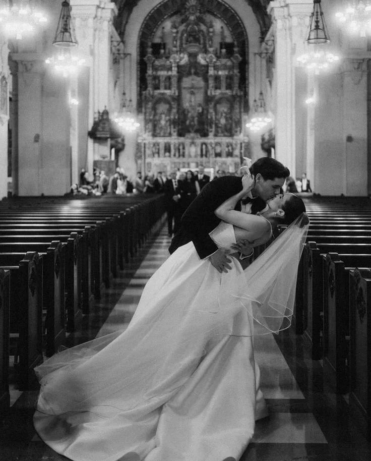
4. Traditional / True to Color
Vibe: Classic, timeless, natural.
Best for: Any venue — especially churches, ballrooms, or heritage sites.
Color Schemes That Shine: Traditional wedding palettes — navy + blush, gold + ivory, emerald + white.
Why It Works: True-to-color editing ensures your palette looks exactly as it did on your day, preserving timeless beauty.
5. Vintage Film Inspired
Vibe: Nostalgic, textured, artistic.
Best for: Historic venues, boho settings, or anything with character.
Color Schemes That Shine: Warm, muted palettes — rust, olive, mustard, cream.
Why It Works: Film-inspired editing brings a touch of nostalgia; colors are softened and desaturated for a romantic, old-world feel.
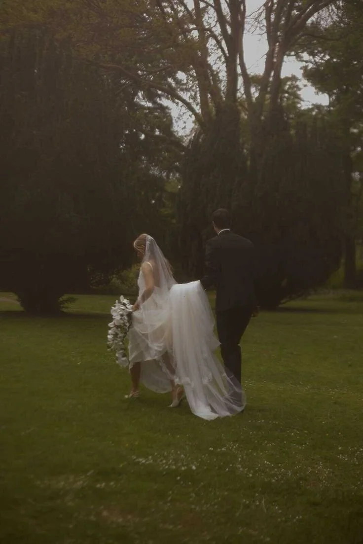


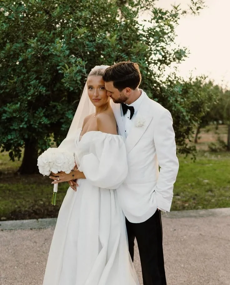
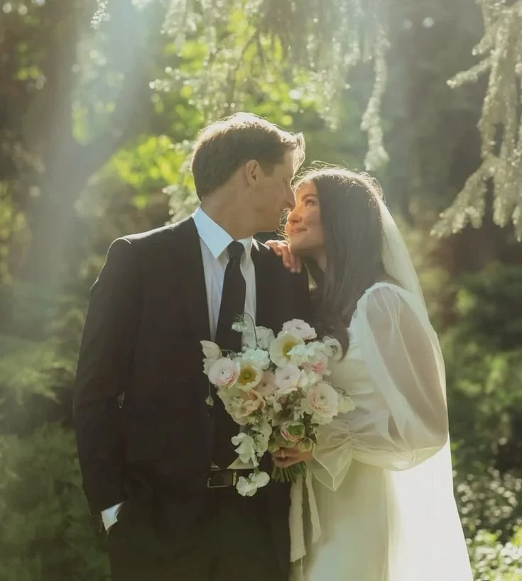
6. Light + Airy
Vibe: Soft, romantic, ethereal.
Best for: Outdoor, garden, coastal, or naturally bright venues.
Color Schemes That Shine: Soft pastels — blush, sky blue, lavender, pale peach.
Why It Works: This style enhances brightness and delicacy — light colors glow beautifully while darker ones can lose contrast.

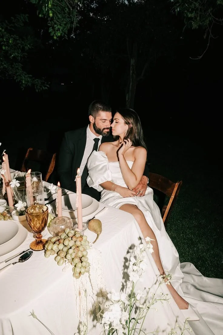
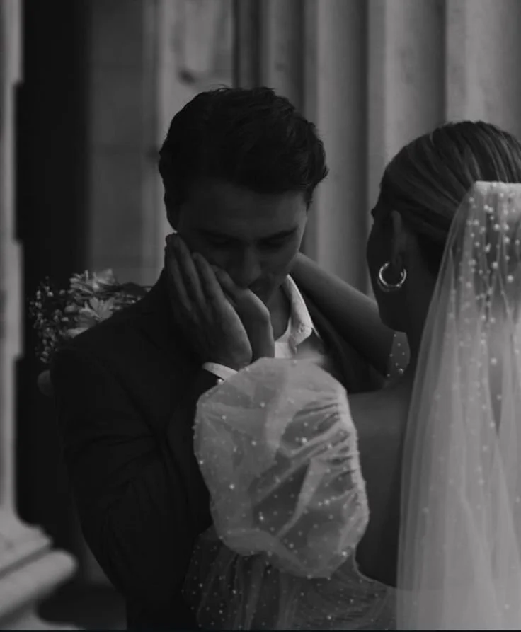
7. Dark + Moody
Vibe: Emotional, cinematic, intimate.
Best for: Forests, industrial venues, candlelit receptions, autumn or winter weddings.
Color Schemes That Shine: Deep, rich tones — burgundy, emerald, navy, terracotta.
Why It Works: The shadows and contrast in this style elevate bold palettes, creating dramatic, atmospheric images.

The Harmony Between the Two
When your color scheme and photography style are aligned, your wedding visuals become more than just pretty; they become powerful.
If you choose warm neutrals and pair them with soft, filmic editing, the result feels ethereal and nostalgic. Combine modern monochrome palettes with high-contrast digital photography, and you get a bold, fashion-forward statement.
Here are a few curated combinations to inspire your own planning:
Olive green, cream, and linen tones + natural light photography - grounded, romantic, effortless.
Black, white, and champagne + editorial flash and contrast - sleek, urban, and modern.
Dusty rose, mauve, and gold + film grain and soft blur - dreamy, vintage, feminine.
Terracotta, rust, and ivory + golden-hour color grading - warm, rustic, and sun-kissed.
Your wedding visuals are the first story your guests experience and the last story you’ll keep forever. Choosing a thoughtful color palette and a photography style that complements it transforms your day from a collection of moments into a cohesive narrative.